The Designer's Secret:
The 60-30-10 Rule
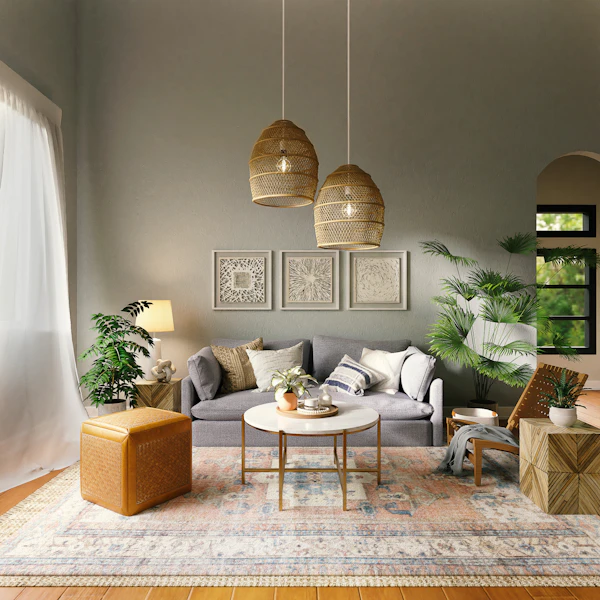
Ever wonder why professional spaces look so perfectly balanced, while DIY rooms often feel chaotic or flat? The secret isn't matching everything perfectly—it's proportion.
The 60-30-10 rule is the golden ratio of interior design. It dictates how much of a room should be covered by your dominant, secondary, and accent colors to create instant harmony.
Explore Our Color PalettesDominant Color
The anchor of the room. It sets the overall tone and backdrop.
Secondary Color
Provides contrast and visual interest. It supports the main color but looks different enough to stand out.
Accent Color
The pop of character. This is where you can be bold, vibrant, or metallic.
The Rule in Action
See how coordinating a dominant slate, a secondary blush, and a light periwinkle accent creates a stunning, modern aesthetic.
Deep Slate Blue
HEX: #5E6D8C
RGB: 94, 109, 140
Use this rich, grounding hue on your main walls to create depth and sophistication in the room.
Soft Sand Blush
HEX: #EACEC5
Perfect for curtains, secondary furniture, or painted main cabinets to add soft warmth.
Pale Periwinkle
HEX: #BAC2D9
A subtle, cool accent for throw pillows, small accessories, or a painted entryway door.
Calm & Forever Trending
Embrace serenity with a curated selection of colors that transcend trends. These calm and peaceful hues create a timeless foundation for any room. Perfect for your 60% dominant wall application.
Professional Finish
Harmony in Practice